Digital Reception
Product design
/
2023–2026
UI and UX design, logo design, design system, user flows, feature design
A kiosk in an empty lobby has nobody to ask. Whoever walks in is a visitor who has never seen it before, a courier in a hurry, or someone looking for a person who may not even be in the building – and the screen is the only thing standing there.
Digital Reception is a self-service kiosk for unstaffed lobbies: check in and out by PIN, QR code or form, log a delivery, look up who is in the building, call a department. I designed the interface, the flows, the icon set and the logo from 2023 on, and have kept extending it since – including rebuilding it in a different brand for every new client.

One kiosk, rebuilt as someone else’s brand every time it ships.
I designed every screen against one question: what would the receptionist have done? She would have looked up and asked what you were there for. So the welcome screen asks that – and which options it offers is configured per lobby, because a building that takes no deliveries has no reason to show a delivery button.

The one screen every client’s brand lands on first – welcome line, logo, colour, all swapped in without touching anything underneath.
A booked visitor already has both a QR code and a PIN – one appointment, emailed out in two shapes – so the kiosk never has to ask which one you brought. They share a screen: scan button, divider, keypad. Only a walk-in with no invitation is genuinely a different case, and only they get the form.
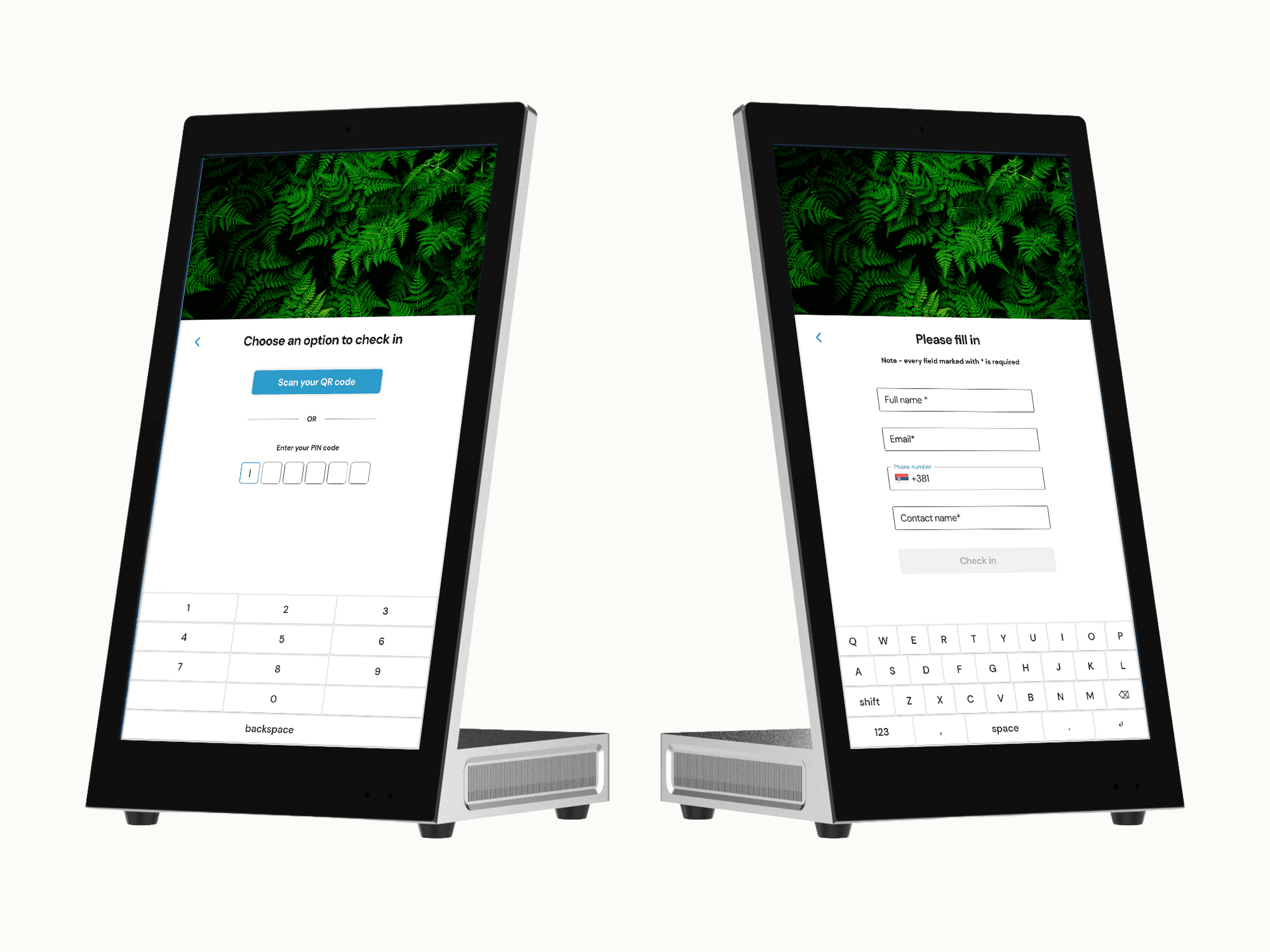
Two ways in – a code on the left, the manual fallback on the right, asking only for a name, email, phone, and who they’re here to see.
Checking out is deliberately thinner. There is no host to notify and no email to send, so it takes a name or a code and shows a success screen. Manual check-in asks four questions; manual check-out asks one. Nobody at a desk would have interrogated a visitor on the way out, and mirroring the two flows for symmetry would have done exactly that.
A courier types the recipient’s name, the notification goes out, and the kiosk offers a call or a text on top of it – the same follow-up a visitor gets after checking in, because the job is the same: tell the right person, then make sure they heard it. The visitor list is the exception to all of it. It is a staff function sitting on a screen anyone can walk up to, so I locked it behind its own masked PIN. Assistance goes back to the public side: a short list of departments rather than one help button, so the call lands where it was going anyway.
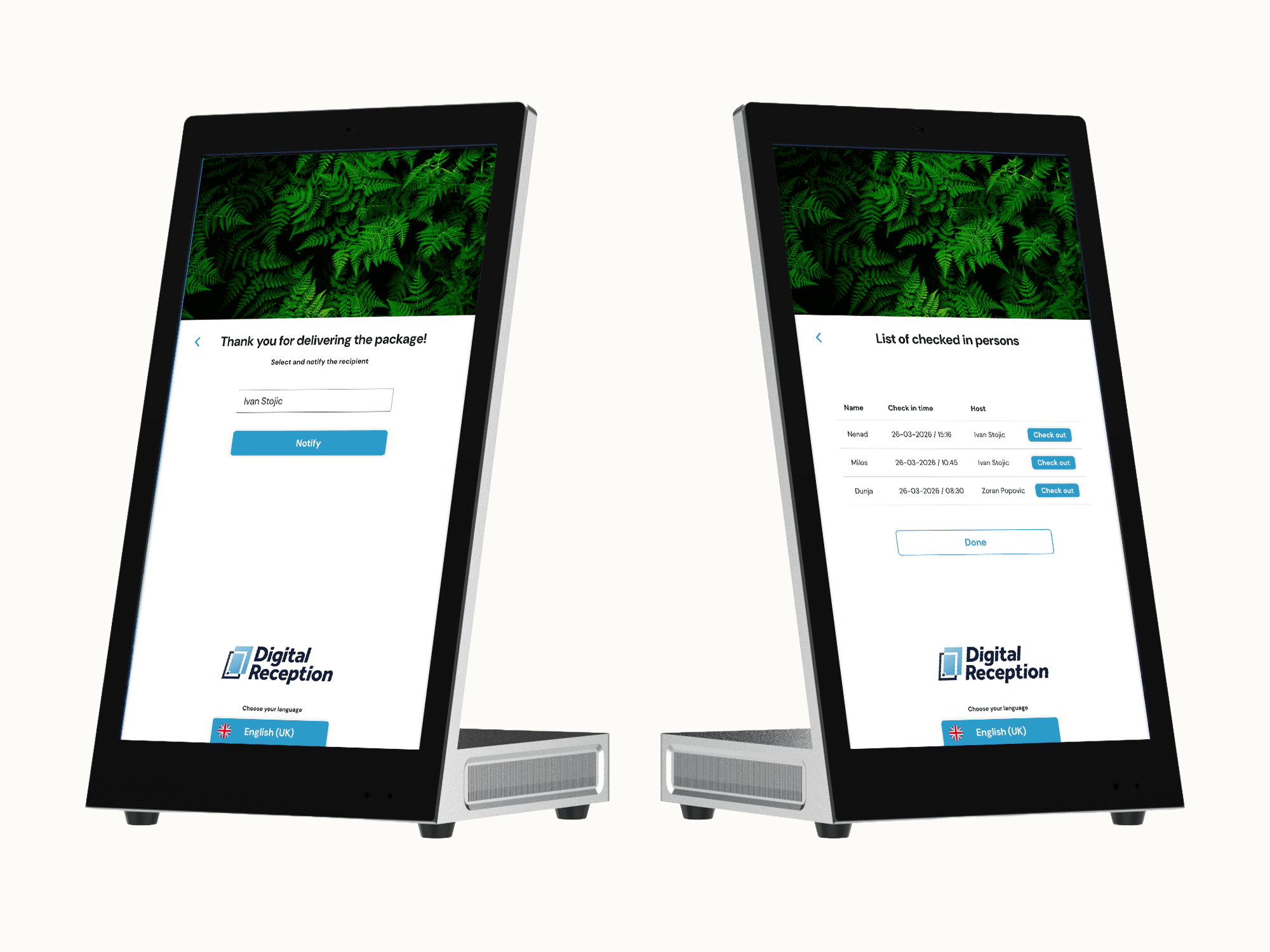
A courier logs the recipient’s name on the left – on the right, the visitor list: who’s checked in, when, and to whom.
What the kiosk cannot inherit is the desk itself. Everything is touched rather than clicked, so the keypad, the full keyboard, the PIN field and every control were built at finger size, and notifications arrive as a sheet up from the bottom rather than a dialog in the middle of the screen. The icons did not arrive as a set either. Most were found rather than drawn, and none of them matched, so they were reworked until they read as one family – and the one or two that existed nowhere were made from scratch.
The kiosk also carries its own mark. I designed the Digital Reception logo alongside the product, not as a job handed over after the interface already existed.

Digital Reception logo
One kiosk, rebuilt as someone else’s brand every time it ships – the flows and the system underneath never change, only what sits on top of them. That includes the mark: on a white-label build the client’s own logo replaces it, the way the colour and the language do. It’s gone out under more than one name – among them Swartberg, Spectro, Daiwa House Modular Europe, and AV & ICT, etc.