Levon
Editorial design
/
2017
Catalogue layout, information architecture, typesetting, photo retouching
A ninety-page product catalogue for Levon, an Indian homeware manufacturer – storage systems, railing systems, kitchen and bath fittings, a hundred and thirty item codes.
The range runs from a plastic cutlery tray to a wall-mounted railing system, so there is no obvious order to put it in. Inside the modular families the problem inverts: a bottle shelf and a multipurpose shelf at the same width are two photographs of the same chrome rectangle.

Ninety pages, a hundred and thirty item codes, no search bar.
Levon spent close to two decades making baskets and sliders that other brands sold under their own names. By 2017 the name on the box was its own, and the whole range had to fit in one book.
Ninety pages, a hundred and thirty item codes, no search bar. Two kinds of reader: one knows where the thing goes, the other knows what it is called. A lookbook by place, then a numbered index. Neither has to do the other’s job.

Overhead Cabinets and Undershelf – the kitchen photographed in use, every product in the shot numbered and named.

Find your way in the catalog – six sections, six photographs, six colours, and the numbers they carry along the page edges.
The colour is load-bearing. Six sections, six hues, each on the divider, under the pages, and in the tab at the edge. Numbering runs section-and-page, so 5-22 still means something said out loud on a phone. The tab sits on the fore-edge, where the thumb is.
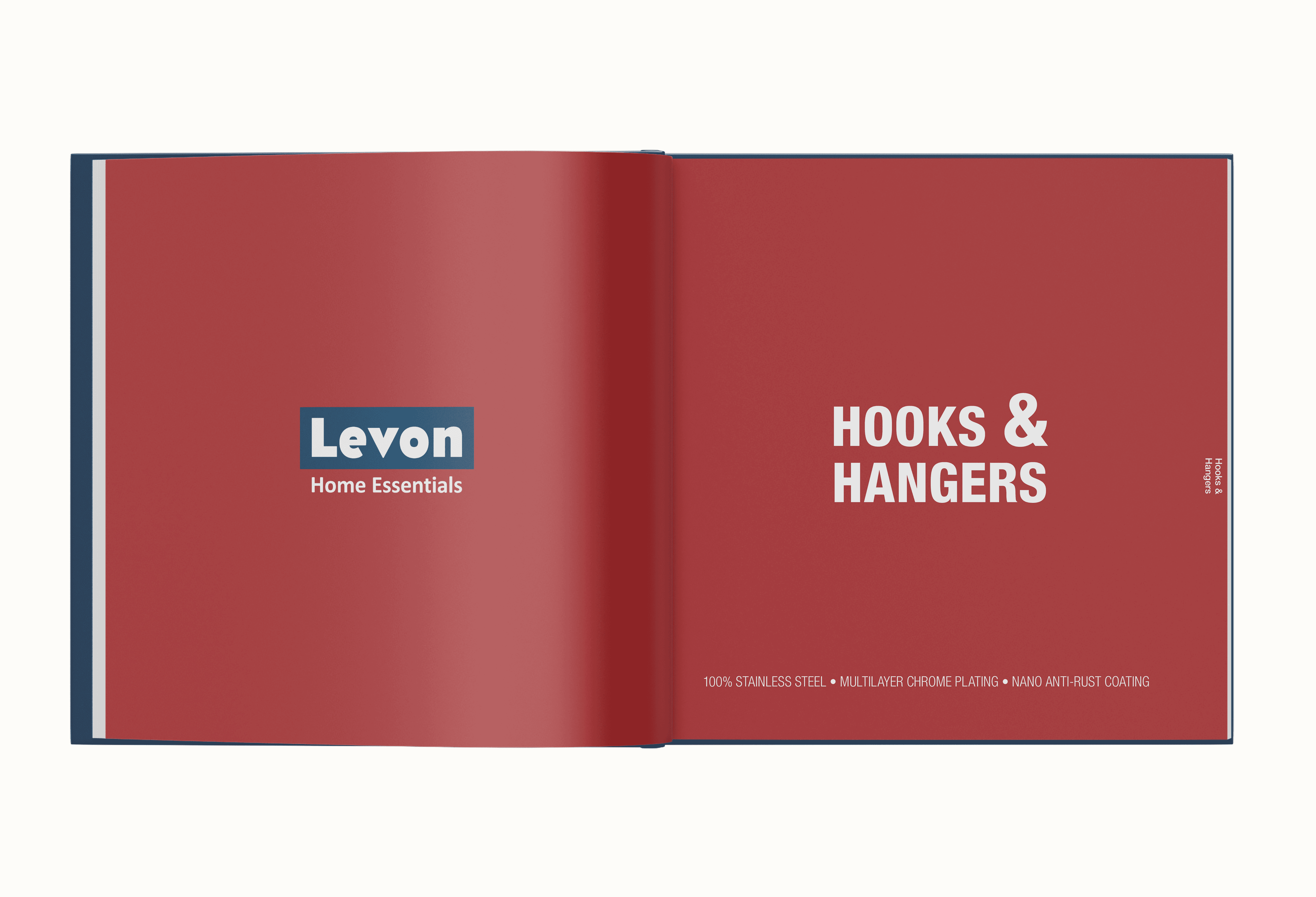
Hooks & Hangers – every section opens like this: the logo, the name, one line of material spec, and nothing else on the spread.
The entry never moves: photograph, name, code, millimetres, price. Same order, same size, every page. Dull on purpose. Two shelves one tier apart are comparable only if nothing around them changes, so every product is cut out and set at one scale on the section tint. A wobble in the frame reads as a difference in the product.
Hooks not included, see page 91. Two and three tier options, page 79. The book keeps pointing sideways, out of the section the reader is in.

Bottle Shelf and Multipurpose Shelf – two sizes each, the entry on a white card, and a note sending the reader to the hooks on page 91.
Density moves with the product. Eight to a spread for the interchangeable ones, a full page where there is something to explain, and where a range varies only by size the photographs stop altogether and a table takes over: tier, width, code, price. The same shelves appear both ways, a page apart.

Polymer Cutlery Tray – a full-bleed photograph on the left, six widths and two finishes tabulated on the right.
The modular systems end on a build-your-own page, and the drawing changes with it: line art, no photographs. A photograph is for choosing. A drawing is for assembling. Frames in two widths and two heights, the parts that fit them underneath, each priced on its own.

Build your own – frames across the top, the parts that fit them below, three sentences in the corner on where to start.